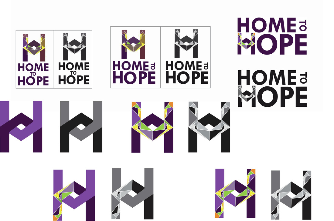
 Tools Used: InDesign - Illustrator This project was a collaborative effort with three other people. We were asked to create a logo for a new brand, Home to Hope. They determine systems and other gaps there are for hosing in the LGBT community. Targeting individuals between the ages of 13-24. Identify cultural competence to define things that do no exist. Be able to provide transitional (24 months to permanent housing). Establish this initiative to beginning stages.
0 Comments
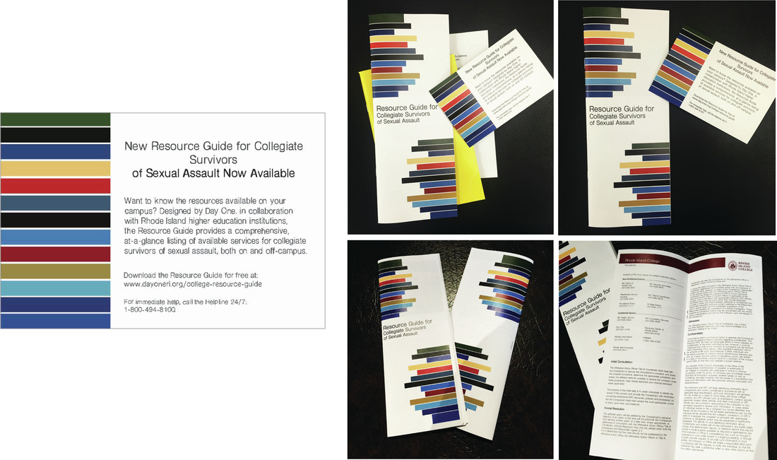 Tools Used: InDesign - Illustrator This project was a collaborative effort with three other people. We were asked to redesign the clients Resource Guide for Collegiate Survivors of Sexual Assault and also create a Postcard for them to announce the Resource Guide. We had to fit every college in the state of Rhode Island into this guide and all their information, and to make it look aesthetically pleasing. With this, we chose to use the school colors from each college listed to great a modern abstract look.
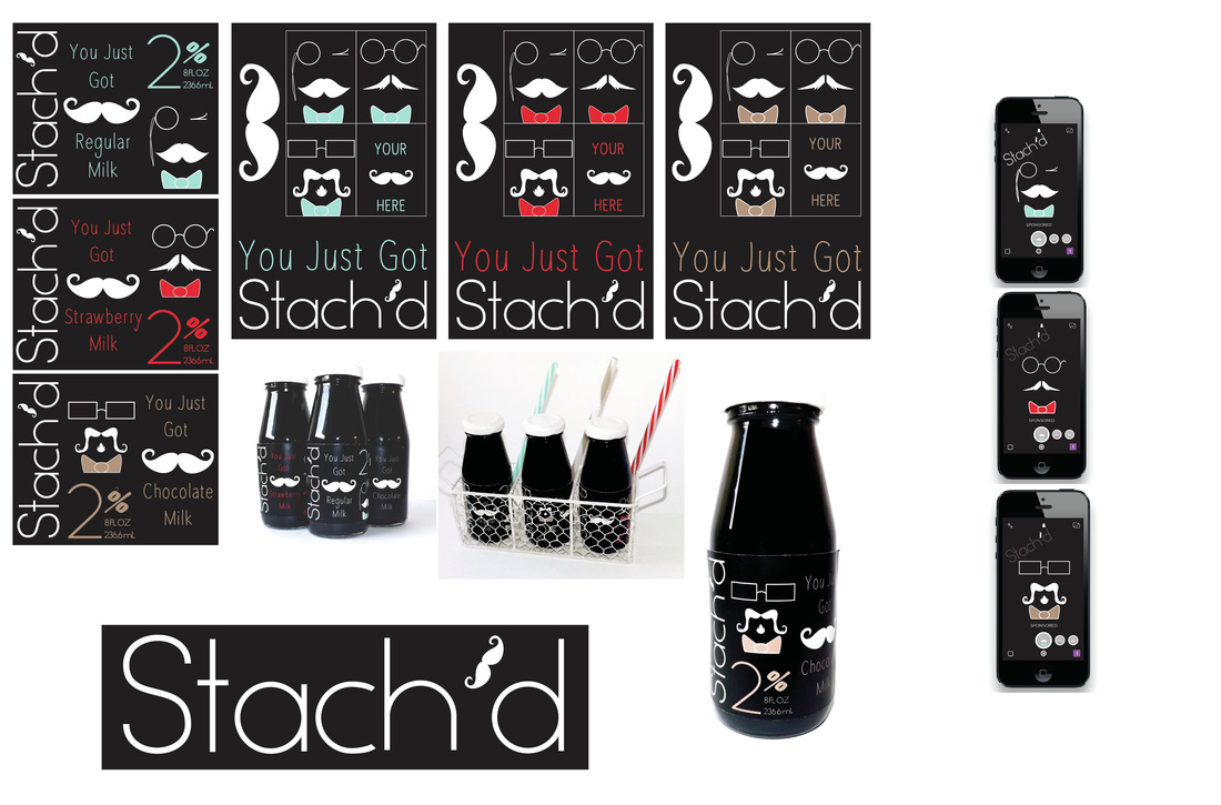 Tools Used: Illustrator - Photoshop I was asked to design and package a beverage of my choice. I decided to use milk as my beverage and called it, Stach’d. I got the inspiration from growing up as a child and always getting a milk mustache when drinking it. I wanted to add a fun little twist for children and adults to enjoy. With this, I also created a Snapchat promo filter and three 11x17 poster advertisements. The flavors used are 2% Regular, Strawberry, and Chocolate.
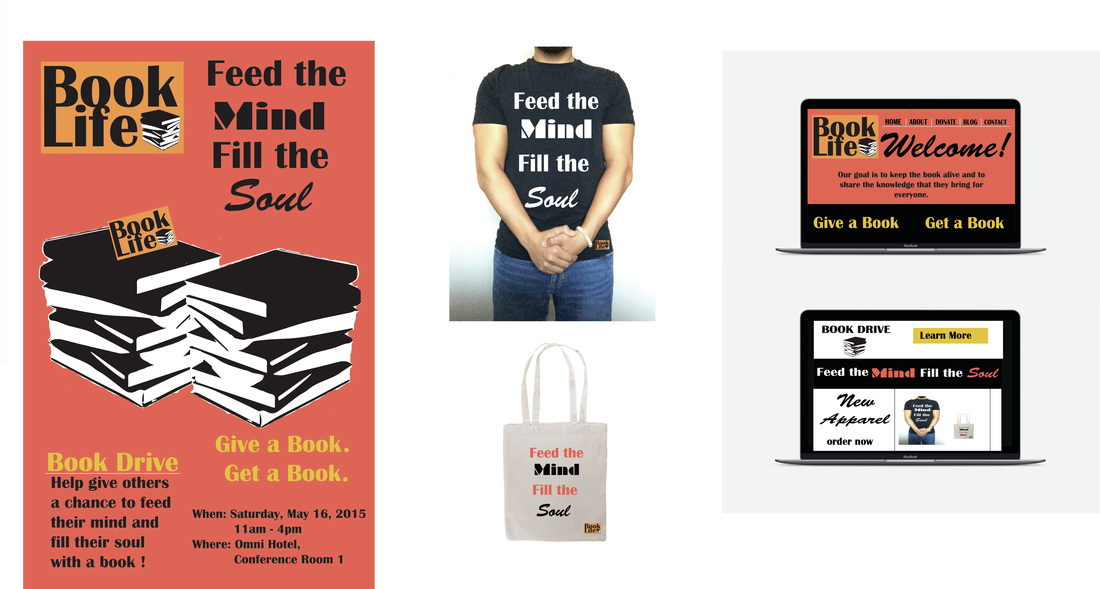 Tools Used: Illustrator - Photoshop I was asked to design a campaign for good and I chose to design a non-profit organization called, Book Life. Its mission is to inspire the public not to forget the printed word as opposed to using tablets and phones. Books are the printed word in its most basic form. The poster is 11x17.
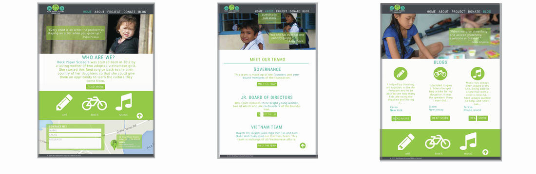 Tools Used: Illustrator - Photoshop This project was a collaborative effort with three other people. The project is designed to invoke emotion. The website we re-created was called “Rock, Paper, Scissor’s Children’s Fund”. We maintained the original colors that used greens and blues to target the maternal demographic. This website itself is a continuous site meaning the user can just keep scrolling down instead of clicking to separate pages.
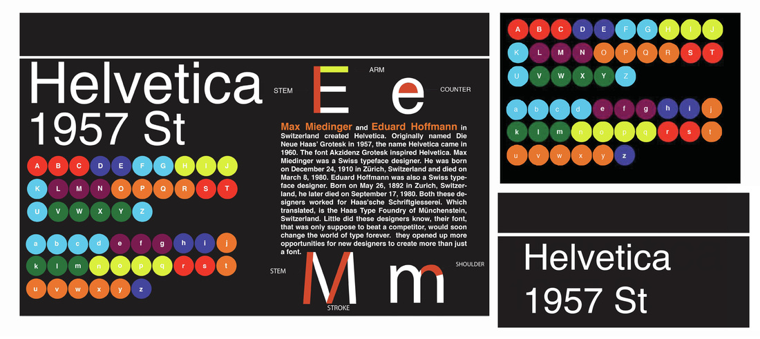 Tools Used: Illustrator - Photoshop I was asked to design an 11x17 typography poster for the font of my choice. I decided on Helvetica with my inspiration coming from the New York City subway system. The subway system relies on colors and letters in order to distinguish each route.
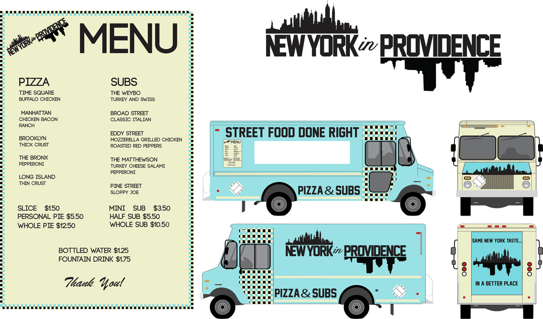 Tools Used: InDesign - Illustrator - Photoshop For this project I was asked to conceptualize and brand a Food Truck, complete with logo, menu, and vehicle graphics. I got the inspiration while eating pizza in Providence and wishing it was like the pizza in New York. I went with this theme because the colors are relaxing, inviting, and give off a clean retro vibe.
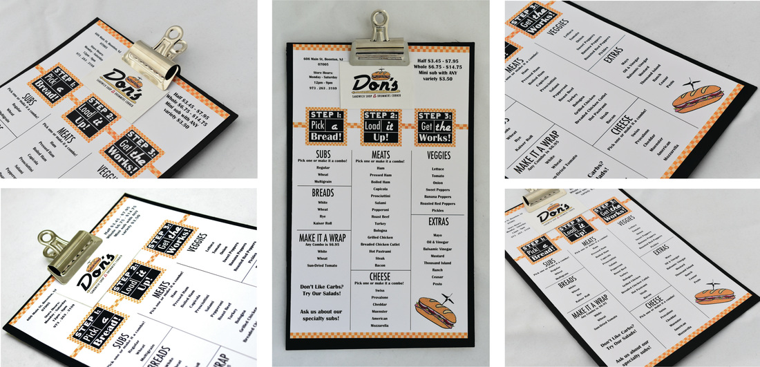 Tools Used: InDesign - Illustrator For this project, I decided to re-brand a restaurant that had two businesses out of one place. With that, it possessed a challenge for me to recreate a logo that combined both, Don’s Sandwich Shop and Drummers Corner. At first, I created a few logos of a drum set with a sandwich in the bass drum but then it became too complex and busy. With that, I took the sandwich and added more details to it and made just the cymbal the toothpick coming out of the sub. I wanted to go for a more fun and retro look to really reflect the establishment and people who own it. I went with the steps on the menu to create more of a fun checklist for the consumer. Lastly, I created stickers to be attached at the top of the menu as a takeaway, it’s small but it is still advertising and reminds the consumer of the fun time they had and the great food they consumed. The colors are simple, but the checkered yellows give it still a retro feel and the black and white steps with different fonts make it stand out.
PROJECT: REALOGY HOLDINGS CORP.
With the time I spent here, I had to stay within their brand standard and learn to multi-task and juggle multiple projects at once. I organized and created 80+ templates within a brand standard for this nationwide company for affiliates to use. I was tasked to design social media banners to promote their new website launch. I produced promotional posters for their Twitter Account. Also, I designed an Info graphic to guide users through their icons. I also delivered a Troubleshooting Guide for their website and a Local Site Search Engine Optimization. I was given materials to research and organize maps to showcase their affiliates top offices. 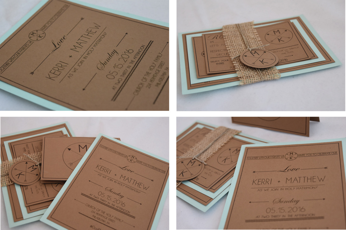 Tools Used: InDesign - Illustrator Tools Used: InDesign - Illustrator For this freelance project, the client had wanted an invitation that felt like home but was also formal. The wedding reception was at a very upscale, refurbished barn. I wanted to bring in that romantic old-fashioned feeling while still keeping it modern and appealing to the clients.
|
Proudly powered by Weebly